My friend was an early beta reader. I gave her a bound copy printed on copy paper and told her to
be careful, watch the edges, don't get paper cuts. She used a piece of canvas to protect her fingers.
It just happened to have her own colorful, original artwork on the piece of canvas, and when she returned
the story to me with her notes, she gifted me the canvas. I felt the
connection between her painting and the story immediately, so it became the
cover illustration for the book.
After the chapter begins with a solid, unmistakeable chapter number, it dissolves into image and verse.
I don't always use such brutal chapter markers, but in a book with such a mixed form, I feel they are a helpful
ground to readers, a place to land in between.
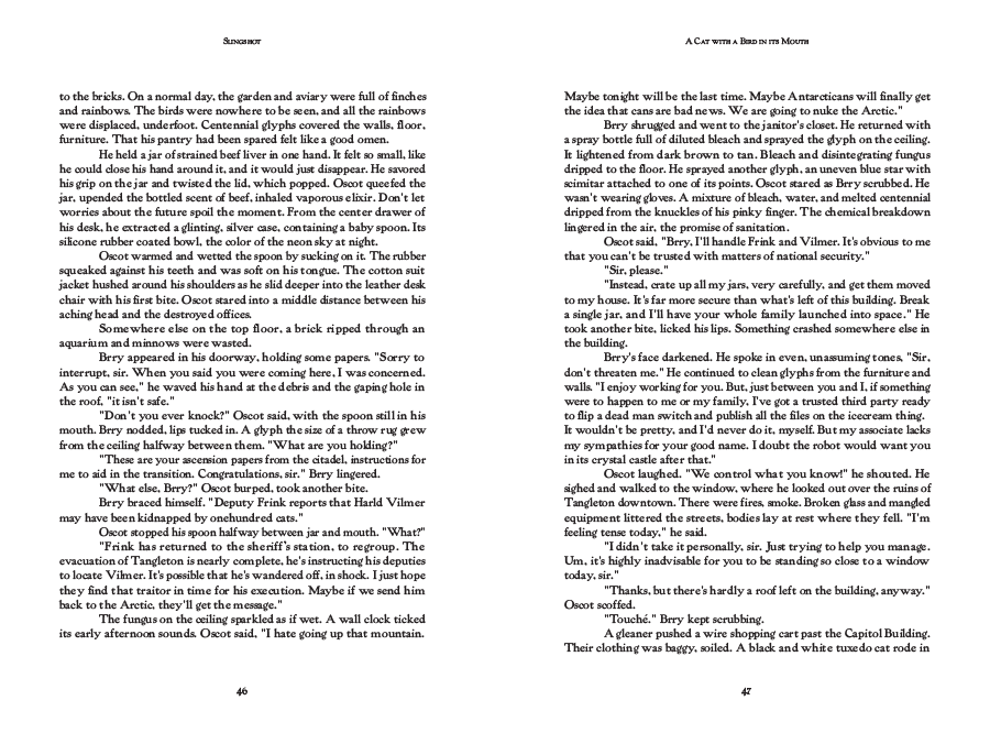
For prose chapter openings, I typically start about halfway down the page.
The fable-like quality of this story called for a drop-cap. The font is Powell. It feels
serendipitous that it is such a shape-shifting font, legible at small sizes, revealed to be
intricate and complex at larger sizes.
The text resumes its single-column grid as though nothing
happened — the watercolor's quiet aftershock left to work
on the reader silently, with no caption or comment to
explain it away.
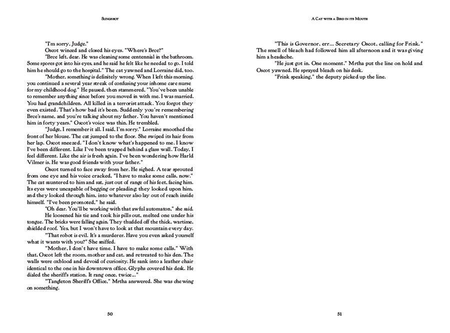
I like tracking position with informative folios, but for them to be as close to invisible as possible. The breaks in this book employ
a disruptive technique, calling back the artwork that opens the chapter. Disruptions become patterns, patterns become ground.
The book is mixed-genre, elements blend between word and design to deepen the story without
exposition. Not all books need this many elements, and I'm happy to keep it simple when the work calls
for simplicity, but I also love being experimental with form.