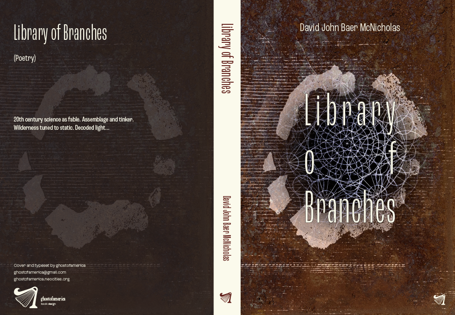
Cover art: pen & ink, mixed media collage by David John Baer McNicholas
Selected Spreads
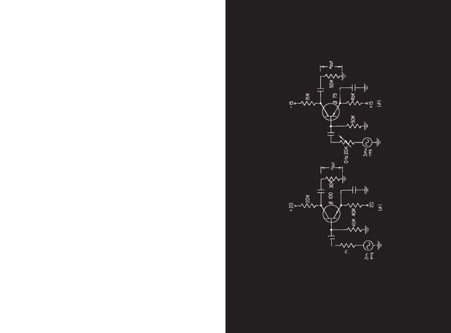
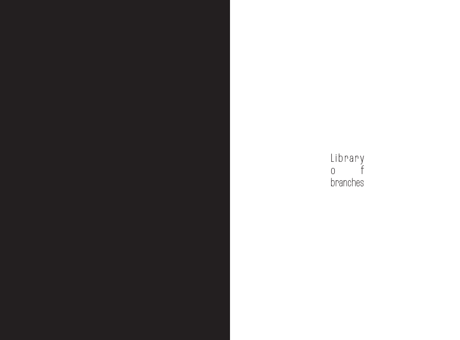
I love collage. Sometimes a collage can be incredibly simple. The cover is a digital collage constructed of original photographs, pen and ink drawing, and found sculpture. The image on the first page of the chapter
is a reduction, context has been stripped from the schematic, allowing a reader to insert
their own meaning.
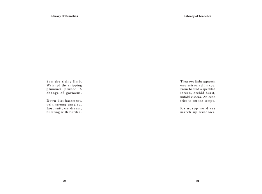
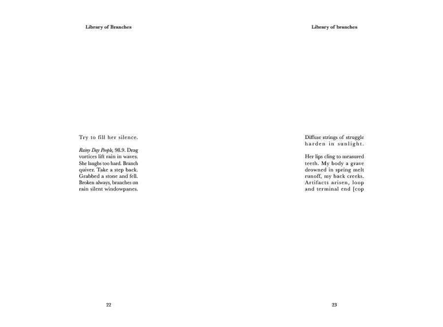
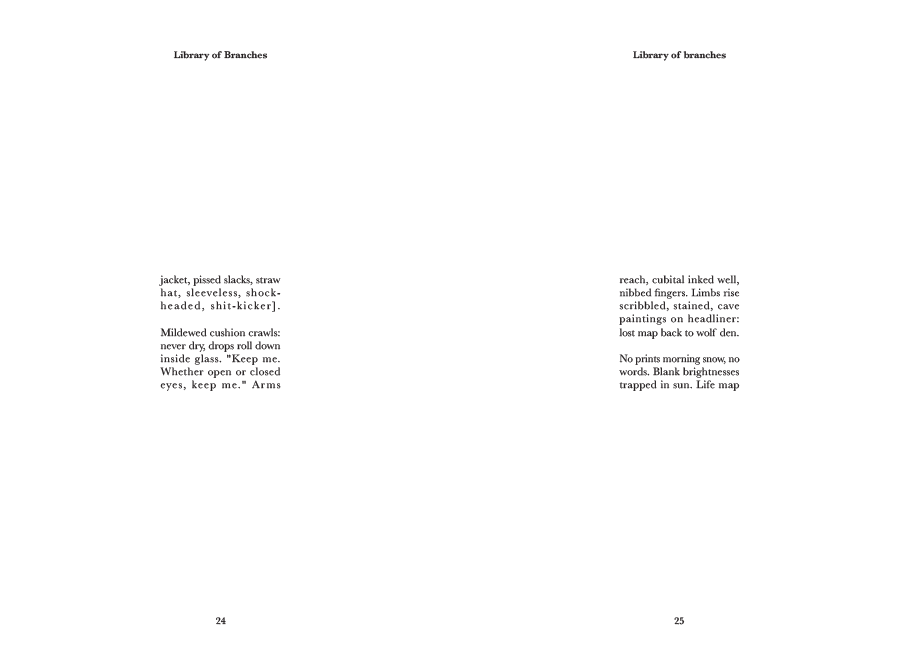
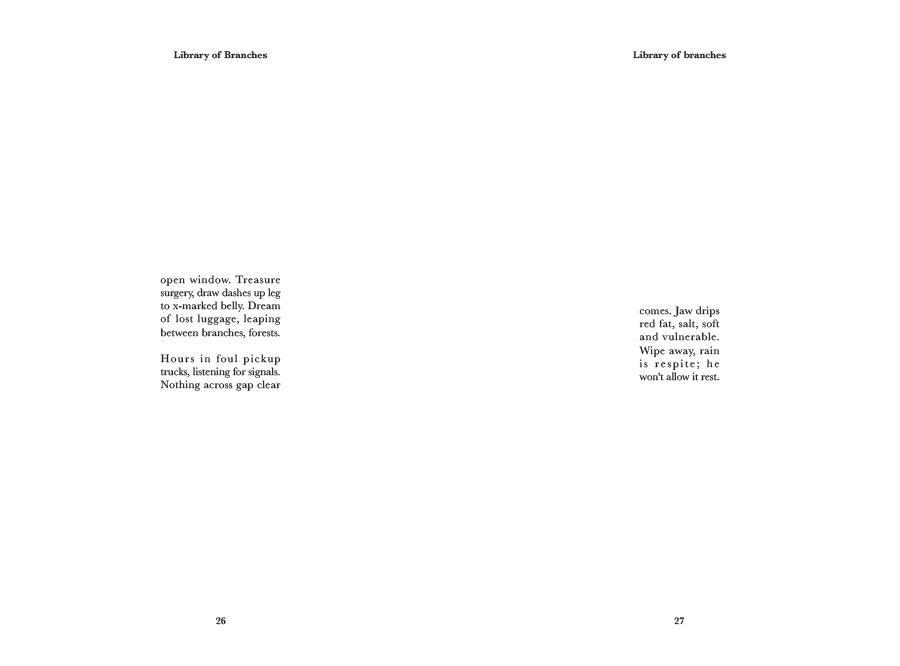
This is a book of poetry, and my goal is to use the balance of white-space and type to build semantic
meaning into the page. In the case of this poem, the words on the page are a frame, a bit literal perhaps,
but I don't think a design needs to be obscure to be effective.
Enjambment and stanza breaks play with the way the words enter the reader's mind, page breaks force contemplation of phrases, creating delayed resolution across the gaps.
I like Baskerville for many projects. It's an elegant and nearly invisible serif typeface.
There is one more page to the poem. To read it, just download the PDF sample. The button is above the cover image, beneath the title.
I think it's interesting how the justification of the lines breaks the letters apart. A major theme in the book is "interval", so this
is a serendipitous artifact.